ProductBrand Studio
Your brand,designed from the research.
Brand Studio reads the concept’s user, job, and evidence, then builds its identity slot by slot: a screened name, a palette that passes WCAG AA, a type pairing, a logo symbol traced to vector, imagery, and the applications that use them. Confirm the required slots and it publishes a brand kit the rest of the project builds on.
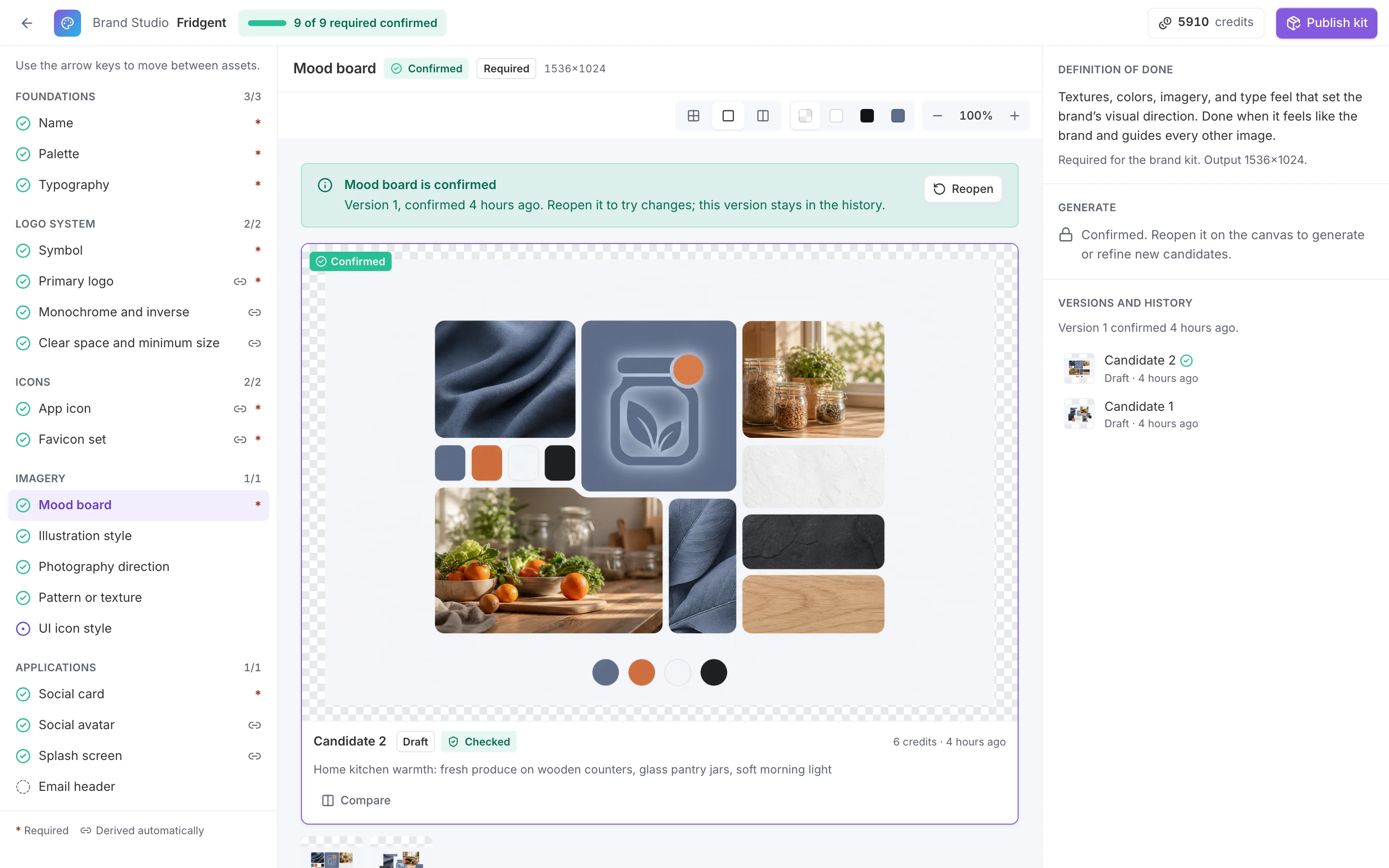
- in the pronunciation and spelling screen
- 12 languages
- enforced on every text and UI pair
- WCAG 2.2 AA
- a logo symbol drafted with GPT Image 2
- Traced to SVG
- published with DESIGN.md guidelines
- Versioned kit
How it works
Slot by slot,each one confirmed by you.
- 01
Brief from the research
The studio starts from the concept: who it is for, the job it does, and the evidence behind it. Nothing is typed in twice.
- 02
Screen the name
Candidates are checked for pronunciation and spelling in 12 languages, pre-screened against US and EU trademarks, and matched with domains and handles.
- 03
Design the identity
Palette, type, logo symbol, and imagery arrive as candidates you compare, refine, and confirm. Derived assets are then drawn in code.
- 04
Publish the kit
Confirming the required slots publishes a versioned brand kit with DESIGN.md guidelines, ready for Mockup Studio and the Builder.
Naming
Names screened,not just suggested.
A name has to survive being said, spelled, searched, and registered. Brand Studio checks each candidate before you fall for it, and says plainly what the check does not cover.
- Pronunciation and spelling screened in 12 languages
- US and EU trademark pre-screen, with other offices as manual links
- Domain availability and list prices through our domain storefront, .com first
- GitHub and npm handles checked live; social handles as manual links
- A first pass, not legal clearance: have counsel review a name before you adopt it
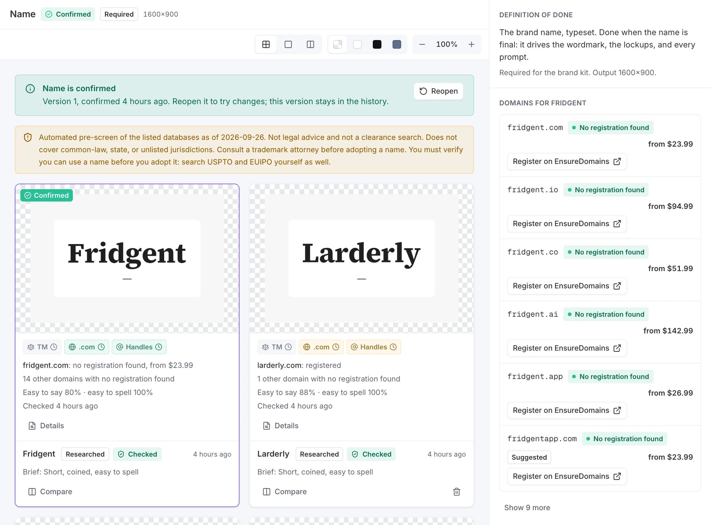
In the product
A brand system,not a single logo.
Confirmed assets from the sample project’s brand kit, as Brand Studio shows them.
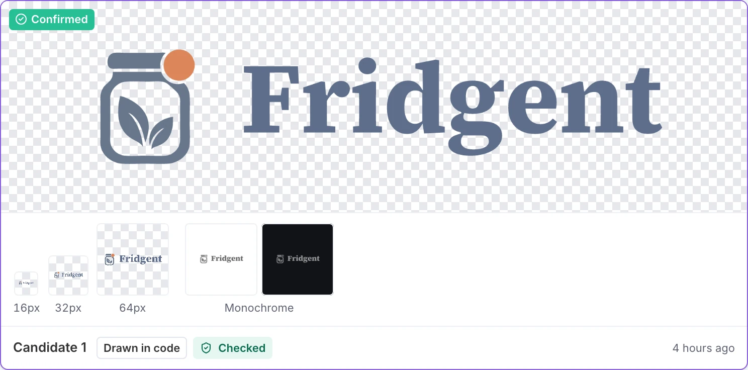
Primary logo
Derived in code from the confirmed symbol, name, palette, and type, with small-size previews and monochrome versions.
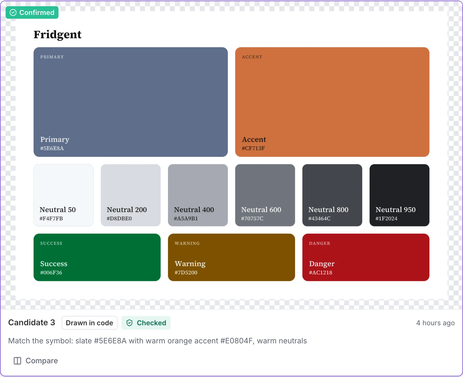
Palette
Primary, accent, neutrals, and status colors, with every text and UI pair checked against WCAG 2.2 AA.
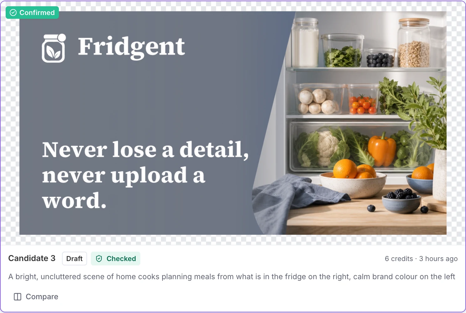
Social card
A 1200×630 card with the exact logo composited in code, not redrawn by a model.
Capabilities
Everything a launch needs,drawn to the pixel.
A palette that passes
Done only when every text and UI pair passes WCAG 2.2 AA: 4.5:1 for body text, 3:1 for UI and large text.
Type you can ship
Twelve pairings from a bundled, openly licensed font catalog, so the fonts in the kit are fonts you may use.
A symbol traced to vector
Drafted with GPT Image 2, then traced to SVG, so the logo stays sharp from a favicon to a billboard.
Derived assets, exact
Lockups, monochrome and inverse, clear space, app icon, favicon set, social avatar, and splash, drawn in code from the confirmed logo.
Imagery and applications
A mood board, optional illustration, photography, pattern, and icon directions, plus a social card and an email header.
Credits you can see
Image runs spend plan credits: 6 for a draft, 22 for a final, with the estimate shown first. Names and code-drawn assets cost nothing.
What you getA brand kit, versioned.
Published kits are immutable, so screens and code always point at the version they were designed with.
- A screened name with domain and handle checks
- A vector logo system with lockups and variants
- An accessible palette and a licensed type pairing
- An app icon and a full favicon set
- A mood board and imagery directions
- DESIGN.md guidelines for designers and agents
Name it once,use it everywhere.
Build the brand from your concept’s research, then carry it into every screen and into the app itself.