ProductMockup Studio
Every screen in your brand,before the first line of code.
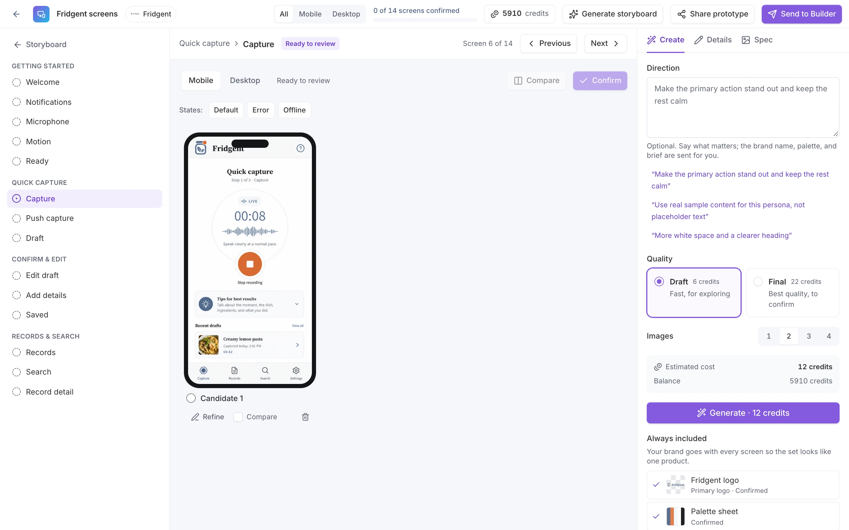
Mockup Studio turns the concept into a storyboard of flows and screens for mobile, tablet, and desktop, then generates each screen with your logo, palette, and type as references. Confirm a screen and its spec is extracted, ready for the Builder to build against.
- across up to five flows, planned from the research
- Up to 24 screens
- mobile, tablet, and desktop
- 3 devices
- per generation, to compare side by side
- 1 to 4 candidates
- regions, components, interactions, tokens
- Editable specs
How it works
From a storyboardto screens an agent can build.
- 01
Plan the storyboard
The studio plans the app’s navigation, shared components, and flows from the concept and its research, within limits enforced in code.
- 02
Generate each screen
Pick a screen and a device, generate candidates with the brand kit as reference, and compare them.
- 03
Refine and confirm
Give written direction or paint a region to change only that part, then confirm the screen you want.
- 04
Extract the spec
Each confirmed screen gets a structured spec: regions, components, content, interactions, and tokens, all editable.
Brand fidelity
Designed in your brand,screen after screen.
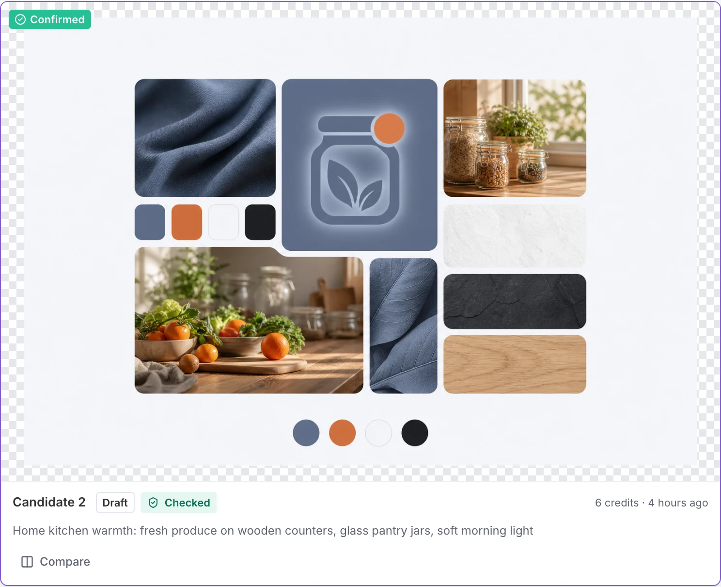
Every generation is anchored to the published brand kit. The confirmed logo, a palette sheet, a type specimen, and the mood board go in as references, and the first confirmed screen per device becomes the style anchor for the rest.
- Logo, palette sheet, type specimen, and mood board as references
- A style anchor per device keeps the set consistent
- Refine with written direction or a painted region
- The credit estimate is shown before every run
Capabilities
A design passthat knows what comes next.
Flows as swimlanes
Every flow side by side, screen by screen, with a frame per device.
Candidates to compare
One to four candidates per generation, with up to eight references, so you choose rather than settle.
Specs from confirmed screens
Summary, regions, components, interactions, tokens, and notes, extracted and editable.
A shareable prototype
A moderated, script-free link that steps through each flow in order, with buttons, arrow keys, and step dots.
Straight into the Builder
Confirmed screens and specs import into the app’s docs/design folder with the brand kit, so the agent builds against them.
Credits shown up front
A draft screen costs 6 image credits, a final 22, and a spec 1. Each run shows its estimate before you start it.
What you getScreens with specs attached.
The screens a stakeholder reviews are the same ones the Builder reads, so nothing is lost in translation.
- A storyboard of flows planned from the research
- Screens for mobile, tablet, and desktop
- Refined, confirmed designs in your brand
- An editable spec for every confirmed screen
- A prototype link to share for feedback
- A design package for the Builder
See the appbefore anyone builds it.
Plan the flows from your research, design them in your brand, and hand the confirmed screens to the Builder.